Anand Sweets & Savouries
As the packaging designer and art director, I worked with Anand Sweets to develop a cohesive, visually rich packaging system that blends tradition with modern appeal.
Anand Sweets, a 40-year-old legacy brand, needed a design that respected its heritage while catering to new audiences. My role focused on translating cultural richness into tangible packaging experiences that feel both premium and rooted in tradition.
Developed at Anomaly Brands (2020-2023)
My role
Packaging Design
Experience Design
Art Direction


‘Anand's legacy establishes itself as the centre of every celebration with the Taste of Indian Royalty’
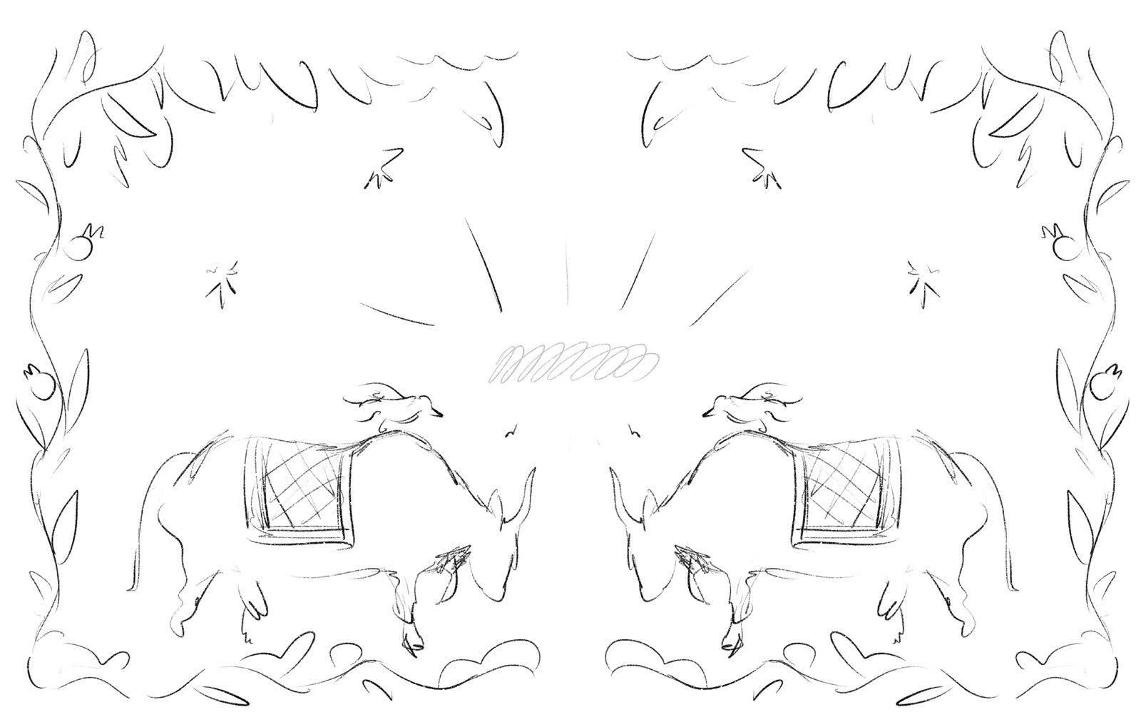
Ode to Sanjhi Folk Art
STRATEGY
A key element of Anand Sweets' packaging was the integration of Sanjhi folk art, a centuries-old Indian papercutting tradition known for its intricate latticework and storytelling.


Sanjhi Folk art

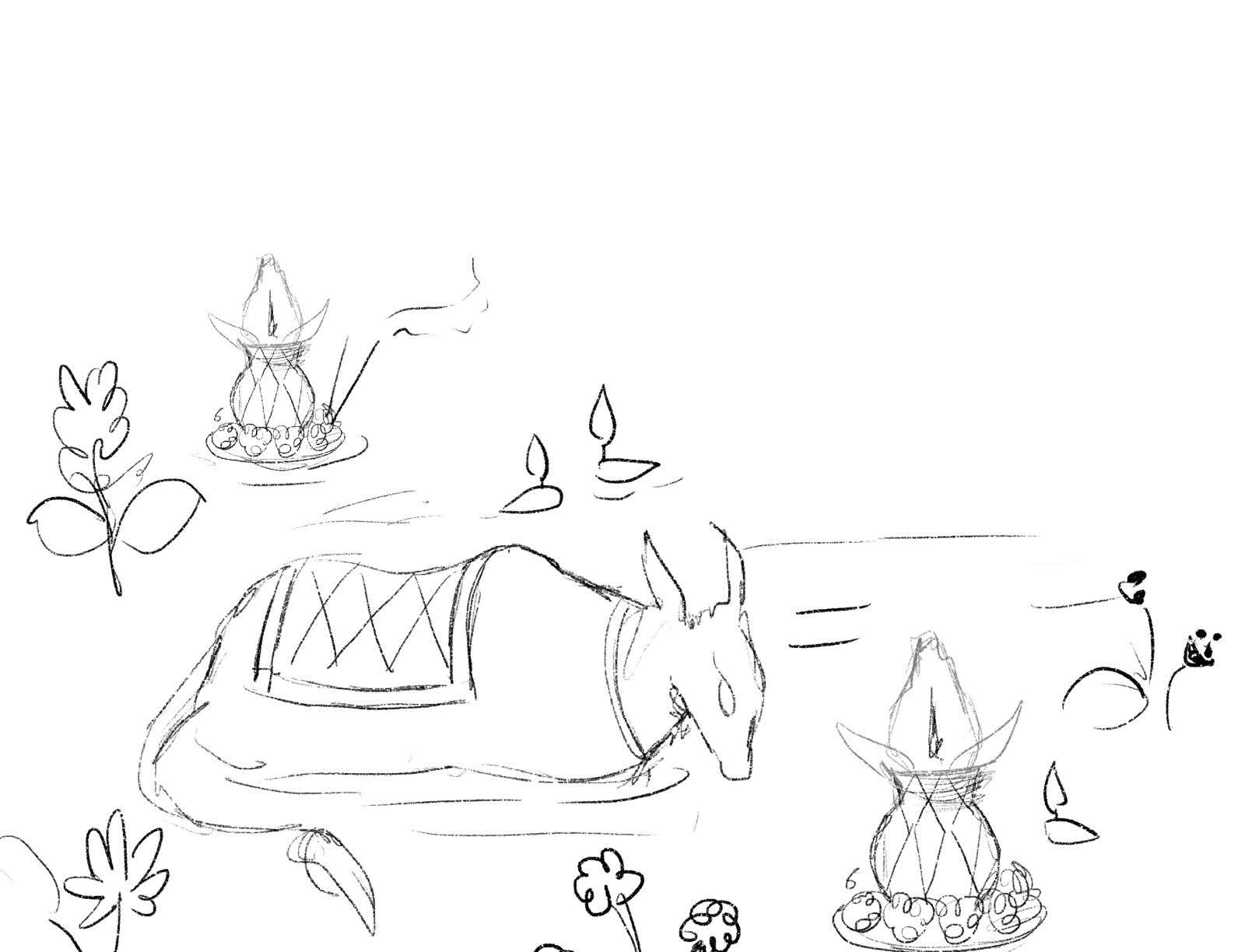
Gifting for Eid
Indian sweets aren’t just treats—they are symbols of celebration, tradition, and togetherness. Approaching the packaging design with the intent to enhance the ritual of gifting, ensuring that Anand’s customers feel the same warmth and nostalgia when receiving their sweets.
Anand's boxes are categorized by --
1. Festivals
2. Across the counter boxes
3. Ingredient Assortments
4. Speciality Sweets
5. Product category (eg : Biscuits, Beverages, Snacks)
Design starts off with sketches to layout the elements and then moves into color + print + rounds of sampling

Festive Gifting : Diwali and Dussera
India’s cultural tapestry is woven with diverse languages, festivals, religions, and traditions—and Anand Sweets has always crafted sweets that bring people together, regardless of background.
A key design principle was to create illustrations that celebrated this universality without depicting specific religious deities, effigies, or human figures. Instead, the visual language drew from flora, fauna, rituals, and architectural elements, allowing the packaging to tell a story that felt inclusive, timeless, and deeply rooted in India’s heritage.
~ 40% jump in sales (festive packaging 2022)
.jpg)


Art Directed an in-store catalog curating the essence of the festival


Festive Carry bags
Specialty Sweets : Mysore Pak
Mysore Pak originates from the kitchens of the Mysore Palace. I infused the box with ornate yet contemporary detailing, inspired by the historic Mysore palace
Since Mysore Pak is a signature gifting sweet, I designed the packaging to feel luxurious and ceremonial, incorporating premium materials and intricate patterns that elevate the unboxing experience.

Mysore palace


Mysore Pak tin box

Cards placed inside the box
Crafting a Seamless Experience Across Product Categories
As Anand Sweets expanded into pre-packaged snacks and tea-time essentials, I refined their packaging system to ensure consistency across different product categories.
The new range of namkeens (savory snacks), daily essentials, and beverages required a practical, on-the-go packaging approach. I worked on optimizing material choices, creating easy-to-handle resealable packs, and ensuring brand cohesion across different product formats.

Almond Biscotti


Savoury Snacks
RETAIL INTEGRATION
Anand Select
With the launch of Anand Select, a 500 sq. ft. express retail model, Anand needed packaging that could seamlessly integrate into modern retail environments while maintaining its heritage-driven identity.
I collaborated with the retail design tea- Azimetri to optimize product visibility, ensuring that packaging stood out while fitting into a strategic shelving system with category-first communication, that grouped products by consumption habits rather than conventional categories.

Clear Labels
With Anand expanding into multiple SKUs of pre-packed snacks, beverages, and single-serve sweets, the packaging had to prioritize:
1. Clear product communication
2. Product Imagery
3. Pack Portability
4. Design Cohesion
We needed a clear label system that incorporated all these design decisions

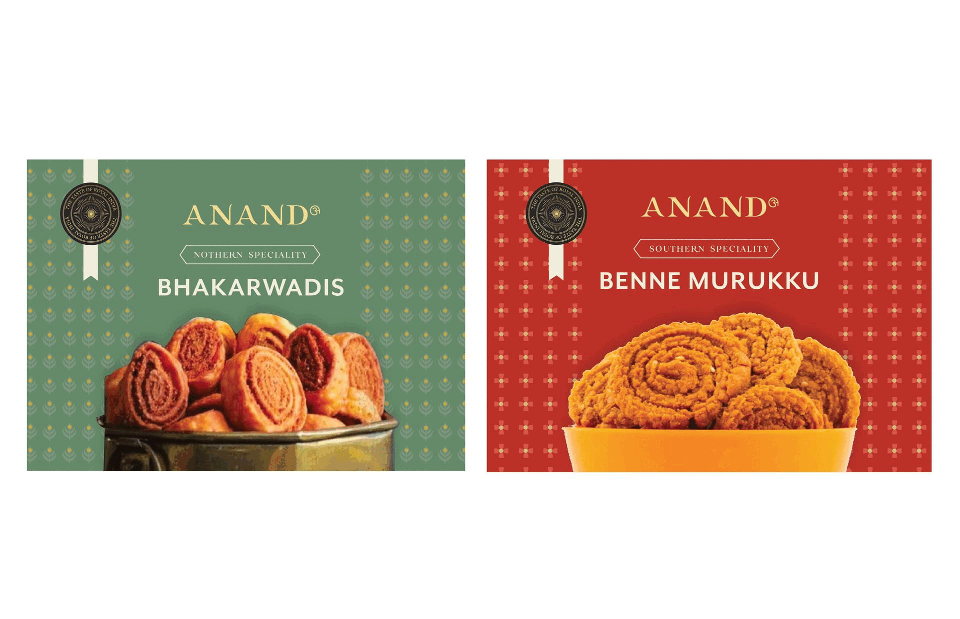

55 unique snack boxes - categorized by region (snacks from North India & South India


