
Ironhill India
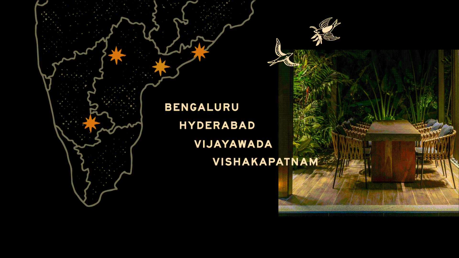
Referred to as Asia's largest Microbrewery, spread across 3.4 acres, Ironhill unites people who seek these indulgent experiences of craft by encouraging and enabling them to explore the same in this independent capital of makers and do-ers.
India’s craft beer market is fragmented, with no clear dominant player. Ironhill had the scale— but lacked a strong, cohesive identity to match its ambition. My role was to define a brand that didn’t just stand out visually but positioned Ironhill as a leader in India’s craft beer space.
Developed at Anomaly Brands
My Role
Visual Identity & Branding
Brand Guidelines
(CHALLENGE)
Creating a Distinct Identity in a Scattered Market
Ironhill needed more than just great beer; it needed a personality that resonated with craft beer enthusiasts and casual drinkers alike. The market was cluttered with small, hyper-local breweries, but Ironhill’s scale offered a unique opportunity to establish itself as a powerhouse.
My task was to craft an identity that felt expansive, ownable, and deeply engaging.

Old Logo
Building an identity for India’s (Largest) Craft Brewery


.jpg)
Treating this as a world-building exercise, I adopted a heraldic approach to the brand identity, building on two-headed tiger (India's national animal) representing Ironhill's brews and celebrating craft. An emblem was essential to an ode to the space

Developed with Divya Negi & Nupur Panemanglor
"The craft of brewing comes with a history of its own. The people behind the majestic stature of Ironhill carry the warmth of the sun, while every sip of our brew capsules the pleasant tranquillity of the moon. Ironhill is for the people, and it shows, every day and night."
.jpg)
What does Ironhill offer now?
An ode to the process of making these brews that emerge from the nodes of the city and its fresh produce. For connoisseurs of craft and a gateway for amateurs of beer. One for all. All for one.
How could the design approach reflect the new set of brand attributes?
I built Ironhill’s brand around storytelling. The name itself evoked folklore, and I expanded on that idea by creating a world where each beer was a character—turning the lineup into a series of legends. This approach made Ironhill more than just a brewery; it extended as an experience.


Collaborating with illustrator Divya Negi on the brew labels, the goal was to expand Ironhill’s visual storytelling across its eight in-house brews.
They also expanded to traditional ales crafted for collaborations with Araku Coffee, and seasonal brews designed to resonate with true craft beer enthusiasts.

.jpg)
Design Approach
Typography: I crafted a type system that balanced heritage and modernity—serifs for storytelling, and sans-serifs for clarity and confidence.
Illustrations: The creatures weren’t just decorative; they personified each beer’s essence, making the brand playful yet premium.
Color Palette: I selected bold yet sophisticated colors to ensure visibility on crowded craft beer shelves while maintaining a refined appeal.
Production: Material selection was key across multiple touchpoints for in-house staff/chefs/managers as well as objects of interaction - drinking glasses, menus, takeaway boxes etc


Impact: Positioning Ironhill as a Market Leader
The result was a brand that reflected Ironhill’s scale and ambition—one that didn’t just blend into the craft beer scene but stood out as a leader. The new identity transformed Ironhill into more than just a brewery; it became a destination, a story, and an experience worth remembering.
.jpg)
.jpg)


.jpg)

